bellbottoms
Pacific Coast Highway

Posts: 727
Likes: 201
|
Post by bellbottoms on May 2, 2020 19:18:12 GMT
I checked and didn’t find an already existing thread for this so… The other day I listened to The Physical World by Death from Above 1979 (now just called Death From Above), and I was reminded of what a cool album cover it has. While it’s not one of my all time favourite albums, the album cover might be one of my favourites.  At first glance, the cover just seems to feature the band’s striking logo against a muted purple twilight sky background. I like this a lot – the black and white pops against the background. But then, when you pull the album sleeve out, you find that there is a band logo shaped cutout, and the logo actually appears on the sleeve with the song lyrics surrounding it. Pulling the sleeve out reveals a bright reddish-pink inner cover. Again, the contrast of the bright colour against the muted purple is striking.   Flipping the cover and the inner sleeve over, the band logo is silhouetted, but it also appears as if you’re looking at it from behind, since the background landscape is different from what’s on the front. The back of the sleeve bears the track listing, depicted as tattoo style illustrations.   I’m thoroughly impressed with the design and work that went into this cover. |
|
bellbottoms
Pacific Coast Highway
Posts: 727
Likes: 201
|
Post by bellbottoms on May 4, 2020 19:36:40 GMT
I decided to change the thread title in order to enhance the curb appeal 😉 I know we have an active thread for BB album covers, but thought we should have one to talk about our favourite album covers in general, as well. Here’s a more well known one… Queen’s News of the World is up there with the best album covers if you ask me. I know we talked about it in the Queen thread, but it deserves a mention here. Fantastic artwork by Frank Kelly Freas, adapted from the cover of a science fiction magazine. Queen named the robot Frank, after his creator.  The album’s outer gatefold depicts the band members falling lifelessly from Frank’s brutal clutches, while the inner gatefold shows Frank peering through the hole he punched through the top of the arena, his massive robot hand reaching for the terrified audience members as they flee. I’m sure there are interpretations to be made about mindless machines and consumption. From the look on Frank’s face, you could even make the case that his violence is unintentional. Whatever it’s supposed to mean, I just really think the artwork is harrowing and magnificent. |
|
|
|
Post by jk on May 4, 2020 21:13:53 GMT
Great topic, bb. Where to start...! This is one I was pointed at a year or two ago. I still think the cover of Gandalf's lone album is super! 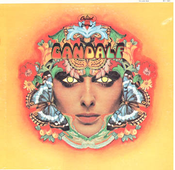 |
|
bellbottoms
Pacific Coast Highway
Posts: 727
Likes: 201
|
Post by bellbottoms on May 5, 2020 12:57:13 GMT
Great topic, bb. Where to start...! This is one I was pointed at a year or two ago. I still think the cover of Gandalf's lone album is super! That's stunning, gorgeous colours and artwork. That might be the most perfect yellow I've ever seen.
|
|
|
|
Post by Sheriff John Stone on May 5, 2020 13:05:45 GMT
An iconic one from the mid-1970's and the Punk Era. The black and white touch is perfect:
|
|
|
|
Post by jk on May 6, 2020 9:32:45 GMT
This is my third attempt to get this posted!! One of my favourites in this genre is The Mothers of Invention's 1968 album We're Only in It for the Money. I don't think I need waste words explaining it! The page linked below contains you all you're ever likely to want to know about its cover art and then some.   globalia.net/donlope/fz/notes/We%27re_Only_In_It_For_The_Money_Cover.html globalia.net/donlope/fz/notes/We%27re_Only_In_It_For_The_Money_Cover.html |
|
|
|
Post by jk on May 6, 2020 12:22:27 GMT
Queen’s News of the World is up there with the best album covers if you ask me. I know we talked about it in the Queen thread, but it deserves a mention here. Fantastic artwork by Frank Kelly Freas, adapted from the cover of a science fiction magazine. Queen named the robot Frank, after his creator. The album’s outer gatefold depicts the band members falling lifelessly from Frank’s brutal clutches, while the inner gatefold shows Frank peering through the hole he punched through the top of the arena, his massive robot hand reaching for the terrified audience members as they flee. I’m sure there are interpretations to be made about mindless machines and consumption. From the look on Frank’s face, you could even make the case that his violence is unintentional. Whatever it’s supposed to mean, I just really think the artwork is harrowing and magnificent. Thank you, bb, for the background information on this artwork. I used to gawp in awe at this album cover in the window of the local record store while waiting for my lift to the airport to clean the interiors of planes. That's the kind of work you have to do if you don't speak the lingo (which I do now, of course). But at least it was clean and safe--scraping gunk off machinery in ships' engine rooms was a lot less fun. 
|
|
|
|
Post by Sheriff John Stone on May 6, 2020 22:01:58 GMT
The New York Dolls turned off a lot of prospective fans with their first album cover:
...but they bounced back big time with their second:
|
|
bellbottoms
Pacific Coast Highway
Posts: 727
Likes: 201
|
Post by bellbottoms on May 7, 2020 12:45:31 GMT
Queen’s News of the World is up there with the best album covers if you ask me. I know we talked about it in the Queen thread, but it deserves a mention here. Fantastic artwork by Frank Kelly Freas, adapted from the cover of a science fiction magazine. Queen named the robot Frank, after his creator. The album’s outer gatefold depicts the band members falling lifelessly from Frank’s brutal clutches, while the inner gatefold shows Frank peering through the hole he punched through the top of the arena, his massive robot hand reaching for the terrified audience members as they flee. I’m sure there are interpretations to be made about mindless machines and consumption. From the look on Frank’s face, you could even make the case that his violence is unintentional. Whatever it’s supposed to mean, I just really think the artwork is harrowing and magnificent. Thank you, bb, for the background information on this artwork. I used to gawp in awe at this album cover in the window of the local record store while waiting for my lift to the airport to clean the interiors of planes. That's the kind of work you have to do if you don't speak the lingo (which I do now, of course). But at least it was clean and safe--scraping gunk off machinery in ships' engine rooms was a lot less fun. Pretty cool bookmark 
|
|
bellbottoms
Pacific Coast Highway
Posts: 727
Likes: 201
|
Post by bellbottoms on May 7, 2020 12:50:37 GMT
The New York Dolls turned off a lot of prospective fans with their first album cover:
If they knew then what we all know now... 
|
|
|
|
Post by jk on May 13, 2020 9:47:28 GMT
Trout Mask Replica is my favourite double LP with some of my favourite cover art: Front: 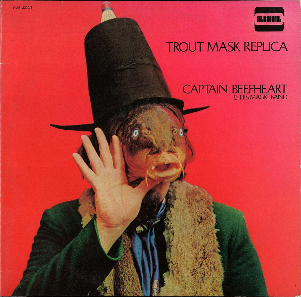 Interior: 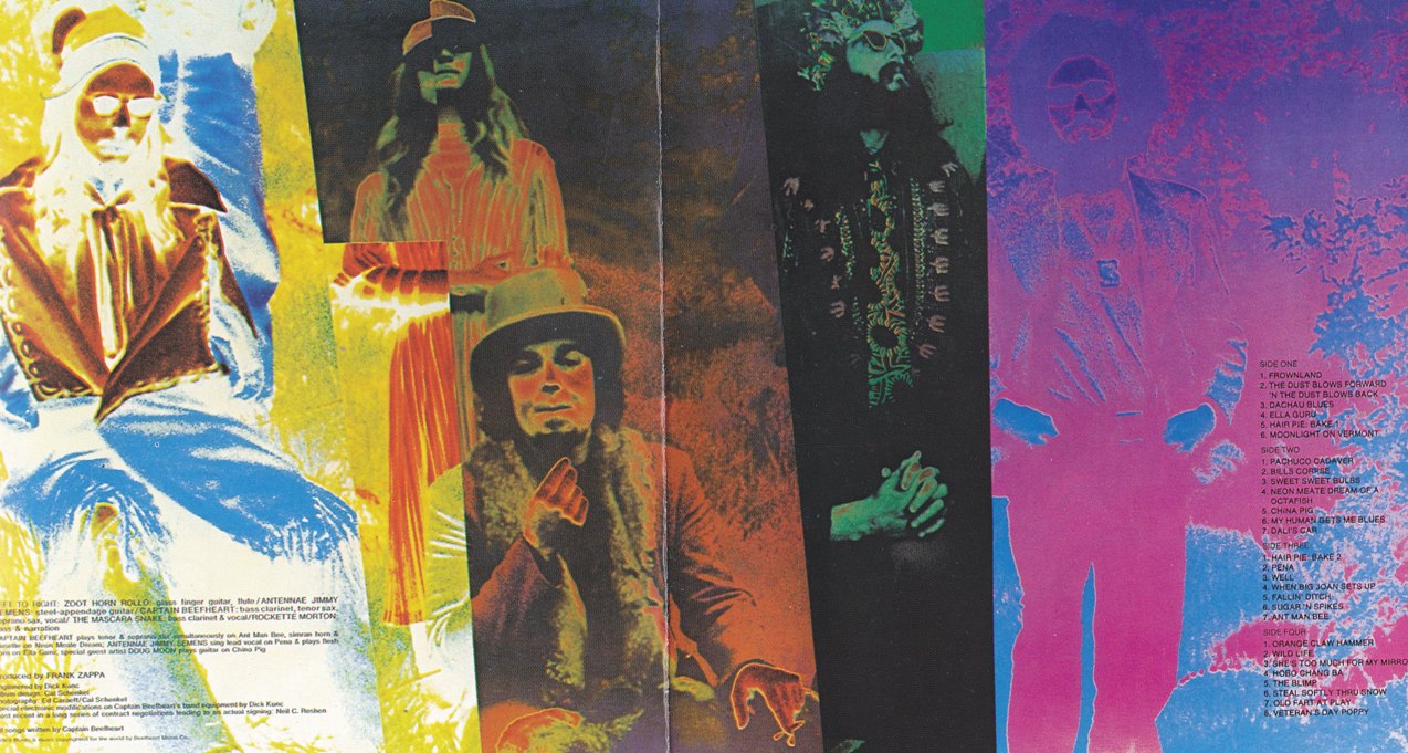 Back: 
|
|
bellbottoms
Pacific Coast Highway
Posts: 727
Likes: 201
|
Post by bellbottoms on May 13, 2020 13:26:28 GMT
The Trout Mask Replica front cover is definitely attention-getting, though it doesn't appeal much to my personal aesthetic. I do like the band photo and the inner gatefold a lot.
|
|
|
|
Post by Kapitan on May 13, 2020 13:36:44 GMT
I feel exactly opposite. The front cover is so disarming, plain, bright red with a hatted fish-head staring at me? One of a kind, much like the music. But the interior, with the filtered (or whatever the term is) colors on the band, looks to me like anything you might have seen in the psychedelic era. Pretty generic.
|
|


:format(jpeg):mode_rgb():quality(90)/discogs-images/R-890352-1420036176-9038.jpeg.jpg)


:format(jpeg):mode_rgb():quality(90)/discogs-images/R-467520-1189530833.jpeg.jpg)


