|
|
Post by Sheriff John Stone on Jul 25, 2020 14:45:55 GMT
I get it. I really do. It was the Summer Of Love, the peak of The Psychedelic Era. So, we get a Beach Boys' album cover complete with flowers, smiling friendly animals, exotic...leaves, smoke, and a house with smiling lips on the front of it. What's in that house? 
You know, in some (many?) ways the front album cover does work. It's hard to imagine a photo of the then current band on the front cover that would work better, though 20/20 comes to mind.
Now, the back cover? It looks a little amateurish to me. A lot of gray there and a not so appealing picture of a flower. I do think they could've put a group photo somewhere on the back. This was a longer than usual time between albums for the band. Also, it's interesting how they "advised" the fans of the lead vocalists on the respective tracks. Were they making some kind of point?
|
|
|
|
Post by Kapitan on Jul 25, 2020 14:54:35 GMT
I basically agree across the board. Front cover is decent, somewhat appealing. Back cover is really dull.
|
|
|
|
Post by B.E. on Jul 25, 2020 15:32:53 GMT
You know, in some (many?) ways the front album cover does work. It's hard to imagine a photo of the then current band on the front cover that would work better, though 20/20 comes to mind.
The pessimist in me is fearful that at least one member of the band would've been omitted from the photo!
|
|
|
|
Post by Sheriff John Stone on Jul 25, 2020 15:47:37 GMT
You know, in some (many?) ways the front album cover does work. It's hard to imagine a photo of the then current band on the front cover that would work better, though 20/20 comes to mind.
The pessimist in me is fearful that at least one member of the band would've been omitted from the photo! Do you mean like these?  These were two I found that might've worked on the back cover:
...or this one...more psychedelic and includes brother Brian:
|
|
|
|
Post by Kapitan on Jul 25, 2020 15:50:01 GMT
Nice tie, Dennis! Way to dress for the photo shoot.
|
|
|
|
Post by Sheriff John Stone on Jul 25, 2020 15:53:14 GMT
Nice tie, Dennis! Way to dress for the photo shoot. Reminds me of another California band who wore ties to a 1967 album cover photo shoot. Robby!
|
|
|
|
Post by B.E. on Jul 25, 2020 16:00:05 GMT
Can you imagine a Smiley Smile album cover omitting Brian?! I actually can. Depending on the day, Brian’s impulse to step back, or simply his irresponsible nature, might have won out. Honestly, I think it was ideal to forgo a group photo in ‘67. The music was radically different, so I think the illustrations are more fitting. (Of course, it’s what I’m used to. Can’t underestimate that.)
|
|
|
|
Post by Kapitan on Jul 25, 2020 16:00:58 GMT
I'm not really that big on fashion one way or the other: I don't pay a lot of attention or care much, as it all seems unnecessary to me. But that said...
There is something cool about bands dressing up a bit for shows or events. It can be dressier clothes, it can be costumes with makeup, but just something beyond the t-shirt and jeans you happened to have on really can make an impression. No, it doesn't affect the music, which for musicians is obviously the real point of it all. But it does make things feel like more of an event, an occurrence.
It's almost like dressing up for church, which I always had to do as a kid when I went to church. Sure, it's hard to imagine any god would care whether you put on that button-down shirt or those dress pants or those painfully uncomfortable dress shoes. But it just feels like you're making an effort. (To this day, when I hear people praise their churches because of their casual attire and atmosphere, it turns me off! If I were a church-goer, I'd go to a cathedral all dressed up well before I'd go to a megachurch in my Sunday morning casual wear.)
The Beatles in suits, the Beach Boys in white suits, KISS in makeup and costumes: cool, every one of them.
|
|
|
|
Post by kds on Jul 26, 2020 3:12:06 GMT
Not a great cover, but an appropriate one.
The shop from the unused Smile cover sitting in a jungle. Its a perfect way to describe the album visually. An album that was supposed to be a masterpiece, lost in the brush.
|
|
|
|
Post by Sheriff John Stone on Aug 8, 2020 12:01:52 GMT
Through the years, on a few message boards, I have read several positive comments on the Friends' album cover. I've never been a fan of it. I'm all for the colorful front cover, and I'm glad that Bruce was finally included after three years with the band. I just think the painting (watercolor?) is horrible. Those are some of the most unflattering images of the guys that I've ever seen. And then they use more of these weird, smiling faces as clouds or...trees. Look at Al's bloated "cloud face". Who is the middle cloud - Bruce Springsteen? And Carl's distorted mouth; I think it's Carl anyway...Who is the "green thing" on the right - an older Jan Berry? WTF. This looks like a poster for a horror movie. Oh, and the Friends/The Beach Boys script? Jeez. 
The back cover is an improvement...though back to the beach? I guess some of the Friends' music fits that theme. The credits are important as this was the first "group album" though Brian was still calling the shots. Overall, it's hard to get past that front cover. I'll pass on this one.
|
|
|
|
Post by Kapitan on Aug 8, 2020 12:10:31 GMT
I don't like it. Not at all. The best thing I can say about it is, the color palette and soft vibe fit the music. But there are endless options for executing a pastoral-vibe cover that would leave this in the trash can of also-rans.
|
|
|
|
Post by Sheriff John Stone on Aug 8, 2020 12:48:59 GMT
Whoops! I bypassed Wild Honey. Oh well, I'll do Wild Honey after Friends.
|
|
|
|
Post by B.E. on Aug 8, 2020 13:26:14 GMT
I think the front cover is fine. Good, not great. The colors fit, the script is cool. I'll agree on one point - the faces in the background could have been much better. It's not ideal that we can't tell who's who or what's what. That said, they're not meant to be fully detailed portraits. The back cover, on the other hand, is great! I LOVE it! Again, the colors fit the music to a 'T'. Perfection. I'd love to frame the photo without the text (although, I wouldn't mind keeping the band and album title). 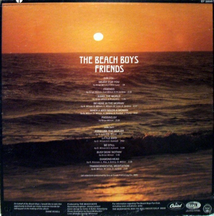 |
|
|
|
Post by B.E. on Aug 8, 2020 14:02:08 GMT
The back cover is an improvement...though back to the beach? I guess some of the Friends' music fits that theme. The credits are important as this was the first "group album" though Brian was still calling the shots. Back to the beach, but not for surfing or girls, for a relaxing, soothing, meditative sunset. Potentially (and indeed in a lot of ways), an era is ending.
|
|
|
|
Post by Kapitan on Aug 8, 2020 14:52:34 GMT
The back cover is an improvement...though back to the beach? I guess some of the Friends' music fits that theme. The credits are important as this was the first "group album" though Brian was still calling the shots. Back to the beach, but not for surfing or girls, for a relaxing, soothing, meditative sunset. Potentially (and indeed in a lot of ways), an era is ending. I think that was the best context to continue as the Beach Boys: maintain sun, fun, summer, relaxation at the beach, but not necessarily in the context of teenage beach fun, surfing, etc. It's why the ecological issues the band took up shortly thereafter actually worked for them. (Not for popularity, but for image. In my opinion, obviously.)
|
|


:format(jpeg):mode_rgb():quality(90)/discogs-images/R-5071148-1383710850-3402.jpeg.jpg)
:format(jpeg):mode_rgb():quality(90)/discogs-images/R-5071148-1383710865-6378.jpeg.jpg)


 These were two I found that might've worked on the back cover:


:format(jpeg):mode_rgb():quality(90)/discogs-images/R-12756031-1541346037-5747.jpeg.jpg)


